
Creating a nurturing brand identity for a yoga and menopause business
In this post, I’m sharing the story behind the brand identity I created for Emma Graham, a yoga nidra instructor and menopause trainer. While I’m currently exploring how I want to offer brand identity services in the future, this project was a great opportunity to design a logo and visual language that captured Emma’s mission of empowering women through rest and rejuvenation. Here’s a look at how we brought her vision to life, and the thought behind every design decision.
When Emma approached me to create the brand identity for her new business, Permission to Rest, I immediately felt connected to her vision. Emma’s work focuses on creating spaces for women to embrace rest as a way to unlock creativity and sustain energy. She wanted her brand to feel nurturing, while also standing out in a professional and crowded wellness space.
Our journey began by diving deep into Emma’s mission and I set out to craft a brand identity that reflected her ethos of rest, healing and renewal – central to her practice of yoga nidra and menopause support.

The foundation
Discovering the heart of the brand
Our process began with deep conversations about Emma's values, her mission and what she wanted her clients to feel. From the start, it was clear that nature's cycles would play a central role in the brand.
Emma was inspired by the rhythms of the earth, the sun and the moon, and we wanted to reflect that connection in every aspect of her visual identity. Words like earthy, warm, slow and flowing kept coming up during our conversations.
Together, we crafted a mood board featuring natural elements: coastal sunsets, trees, the soft touch of hands on tree bark, the feel of pebbles and the soothing rituals of herbal tea and yoga. These images grounded the brand in the earthy, cyclical beauty of nature while also connecting deeply with Emma's mission to help women honour their own rhythms and cycles.

Creating the colour palette
A nod to the Earth’s rich tones
To reflect the brand’s natural, nurturing vibe, we developed a colour palette that was as grounding as it was calming. Starting with Emma's initial mood board, we chose warm terracotta oranges and calming sky blues.
From there, we expanded the palette to include earthy browns, soft creams and a rich golden yellow accent, representing the warmth and energy of "golden hour".
These colours evoke feelings of safety, peace and renewal, creating a brand environment where Emma’s clients can feel supported in their journey towards rest and restoration.

The logo
A symbol of connection & transformation
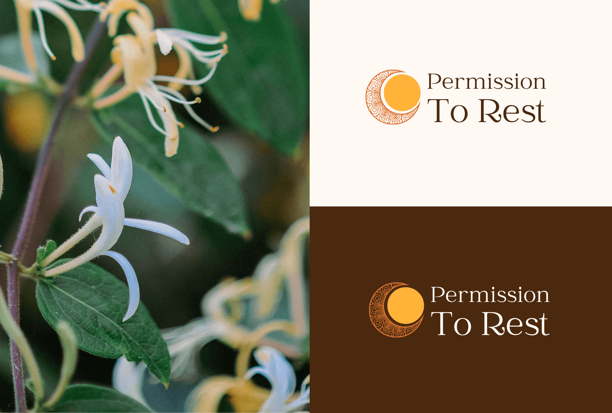
For the logo, we wanted to incorporate shapes that reflected the cycles of nature – circular forms that symbolised the sun, the moon and the transformative journey of Emma’s clients.
Initially inspired by mandalas, we chose a more subtle design that captured their essence but didn’t culturally misappropriate, with a golden circle representing the sun, being held by a patterned crescent moon. This interaction between the two shapes symbolises the nurturing environment Emma creates, where her clients feel held and supported.
The intricate pattern inside the crescent added a thoughtful detail that Emma loved, reflecting the layered beauty of the work she does and her commitment to providing a safe space for transformation.
The final logo design embodies the essence of Permission to Rest, combining warmth, nature and support in a way that deeply resonates with Emma’s audience.
Typography
Balancing elegance & approachability
Choosing the right typography was key to reflecting the tone of the brand.
For the logo, we selected Catchy Mager, a rounded serif font with soft, flowing letterforms that mirror the gentle and welcoming vibe of Emma’s business.
For the website’s headings, we opted for Playfair Display, adding a touch of sophistication without compromising on warmth.
For the body text, Inter was used, ensuring readability and a modern touch that balanced the overall design.

Brand guidelines
A cohesive foundation
To ensure Emma could carry her brand confidently into every aspect of her business, I created a detailed set of brand guidelines. These guidelines act as a practical toolkit, providing clarity on how to use the brand elements consistently.
This document ensures that Emma, or anyone working with her, can maintain her brand’s integrity across all platforms.
Wrapping up
I’m so proud of how Emma’s brand identity turned out, and it’s been a joy to see how it has helped her build a business that truly reflects her values. It’s a reminder of the power of thoughtful design to connect deeply with the people it serves.
While I’m still figuring out exactly how I’ll be offering brand identity services moving forward, I’m always open to exploring how I can help businesses create an authentic, nurturing brand presence. Whether you're looking for a simple logo and color palette or something more comprehensive, I’d love to chat about how I can support your vision.
Feel free to reach out if you’d like to discuss your ideas and how we might work together to build a brand identity and a website that truly reflects your business and your values.